Table of Contents
Factors to consider before choosing a retail store layout design.
Choosing the proper store layout maximizes sales and profit. The store's floor plan and design directly impact the customer's shopping experience, affecting their browsing behavior, impulse purchases, and overall satisfaction.
A good store layout helps customers find products easily and encourages them to buy more. In contrast, poorly designed retail store layouts can confuse customers, limit browsing opportunities, and waste valuable floor space. These factors contribute to a decrease in sales.
Strategic retail store layouts boost profits by effectively showcasing and displaying the most profitable items in strategic areas. Placing high-profit items at eye level near the entrance attracts impulse purchases. The additional planning is also beneficial for safeguarding valuable merchandise and reducing the likelihood of theft.
This article focuses on selecting the proper retail store layout design. We will discuss different shop layout options to help you boost sales and enhance your store's bottom line.
1. Determine the type of retail store you are starting.
Are you a small resale store or consignment boutique planning to make your money on fewer, more profitable items? Or are you a vendor mall aiming to sell a wide variety of items at scale? Knowing this will quickly narrow down floor plan options for you.
2. Assess the types of inventory you will carry.
It is essential to sort your inventory by category. Once you have reviewed all your inventory, decide how you want to display it. For instance, most stores separate men's and women's clothing into different areas. However, one could display accessories in one location or scatter them throughout the store.
3. Forecast expected traffic and guest count.
Guest count and foot traffic are crucial factors that can significantly impact your store's layout plan. The expected number of visitors affects aisle width and decompression zone square footage. The decompression zone is where customers enter the store, stop, and decide where to go. Additionally, allocating floor space according to traffic types allows you to strategically place high-profit items and encourage impulse buying.
4. Consider additional points of entries and exists.
Before selecting a floor plan, it's essential to determine the locations of entrances, restrooms, emergency exits, fitting rooms, and restrooms.
7 Popular Store Layout Examples
1. Free Flow Store Layout (or Boutique Layout)
A free flow floor plan (or boutique floor plan) involves arranging elements in a seemingly sporadic manner while maintaining control. From the customer's perspective, a boutique layout design lacks a formal structure, but nothing could be further from the truth.
In the free flow layout:
- Displays are stationed sporadically to create a high-end look with visual interest.
- Resalers influence traffic flow and boost sales by strategically using subtle signage to guide guests throughout the store.
- The store often stations the checkout counter near the dressing room to assist customers.
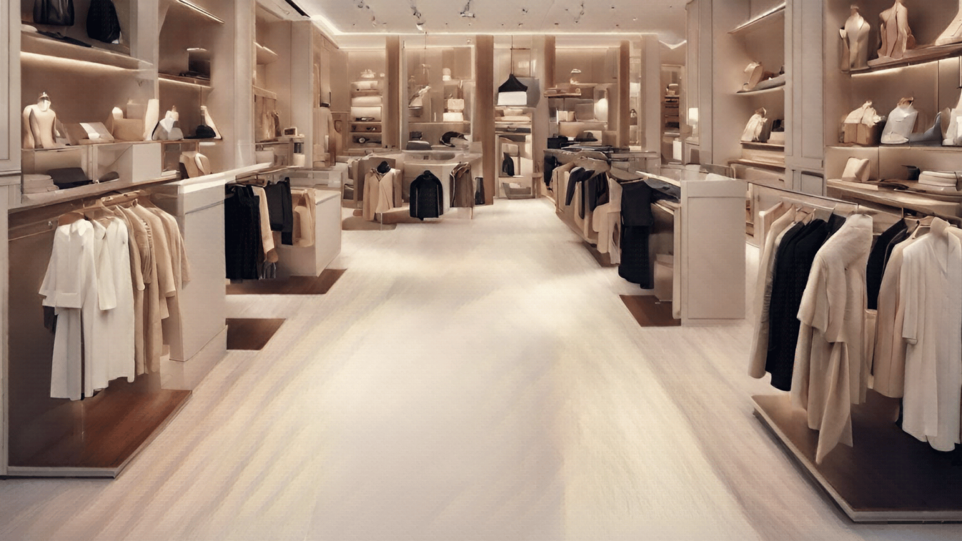
Free Flow Store Layout Examples
.png?width=1920&height=1080&name=Free%20Flow%20Store%20Layout%20Example%20(1).png)


Who is the free flow store layout best for?
The free flow layout (or boutique store layout) is typically found in smaller boutique-style consignment stores with less merchandise. However, a larger store or vendor mall might use it to create visual themes or make each vendor's section feel like its own miniature store.
Pros:
- Easier to create a unique brand experience within your resale store.
- Perfect for small stores to notably display high-end merchandise
- Promotes impulse purchasing
- There is more space between items
- Customers are less likely to bump into each other, allowing for a better shopping experience.
Cons:
- Less space to display the product
- More expensive to prominently display merchandise
- Navigating the store may be confusing for customers
- Easier to forget the golden rules of merchandising, causing lower sales and profit
- Difficult to clean
2. Grid Store Layout
In a grid store layout, the merchandise is displayed in a series of long, straight aisles. Products are showcased on both sides of the aisles. The space between each aisle is usually wide enough to accommodate shopping carts.
This unique characteristic of grid layout design aims to maximize product display and minimize empty spaces. Items bought on impulse are near the front, while staple items are at the back. The ends of the aisle are prime real estate, and many retailers use prominent end-cap displays to highlight select products.
Who is the grid floor plan best for?
Discount resellers targeting high-volume sales and stores over 6,000 sq. ft. prefer the grid floor plan despite its unattractive appearance. That's because it allows them to display large quantities of goods with a minimal investment in furnishings and fixtures.
Pros:
- Inexpensive fixtures
- Large merchandise exposure
- Maximizes floor space
- Simple to organize
- Intuitive and straightforward for customers to navigate
- Ease of cleaning
Cons:
- Visually unappealing
- Limits browsing
- Encourages rushed shopping behavior
- Challenging to display complex and specialty products
3. Herringbone Store Layout
The herringbone floor plan is a type of grid layout suitable for stores with long and narrow retail spaces. The two layouts are different because the herringbone layout only has one pathway for customers to browse the store. The shop's entrance and checkout are at opposite ends, and the aisle of products is tightly packed between them. The store has a single central aisle that runs from the entrance all the way to the checkout area.
Herringbone Store Layout Examples

.png?width=1920&height=1080&name=Herringbone%20Store%20Layout%20Example%20(1).png)
Who is the herringbone store layout best for?
The herringbone floor plan is best for small, product-packed stores needing to maximize floor space.
Pros:
- Easy for customers to navigate
- Simple to organize products cohesively
- Creates a lot of display space
Cons:
- A lot of merchandise in close areas makes the space feel smaller and cramped.
- Reduce staff visibility and control over the guest experience
- Small stores with limited staff may have difficulty monitoring the store's entrance from the cash register
- Increased the likelihood of theft
4. Diagonal Store Layout
The diagonal store layout resembles the grid floor plan, but it turns all the aisles at an angle. The angled shelves show more products to shoppers and direct them towards the cash register.
Who is a diagonal store layout best for?
The diagonal floor plan is excellent for stores with limited retail space. It maximizes floor space and allows customers to see more products.
Pros:
- Improved traffic flow and customer circulation
- If we strategically locate the checkout, staffers can easily see guests and have a better view of each aisle.
Cons:
- Customers can cut through aisles and skip entire sections if desired
- Diagonal isles may confuse customers
5. Spine Store Layout (or Straight Store Layout)
A spine layout is a store layout with one central aisle running from the front to the back. The spine aisle is usually the store's broadest and most significant pathway. Shelves on both sides of the aisle help customers navigate the store.
Spine Store Layout Examples
Who is the spine store layout best for?
This spine floor plan is advantageous for department stores since it makes it easier to move between floors. Specialty stores between 2,000 and 10,000 square feet frequently utilize this design type. Consider using different flooring materials for various departments to aid in navigation from one area to the next.
Pros:
- Easy for guests to navigate.
- Great for larger stores with an extensive inventory that need departments.
- Efficient use of space.
- Encourages customer browsing
- Great view of the sales floor
Cons:
- Requires a lot of space.
- Purchasing a variety of fixtures can be costly.
- Steering shoppers away from the main aisle involves creativity.
- The "spine" or central aisle can become congested and block traffic in high-volume areas of the store.
6. Loop Store Layout (or Racetrack Layout)
The loop floor plan is a retail layout design with a central aisle looping around the store. Typically, retailers display merchandise in the middle and on the side walls. This layout maximizes the floor space and ensures that customers see everything that is for sale.
People often refer to this popular store layout as a racetrack store layout because of its circular design. The loop layout of the store helps customers navigate and encourages them to explore the edges.
Loop Layout Examples
.png?width=1920&height=1080&name=Loop%20Store%20Layout%20Example%20(1).png)

Who is the loop layout best for?
The Loop store layout is frequently used in larger retail spaces. It is effective for showcasing a wide range of products, as it guarantees that customers view all the available merchandise. To enhance customer flow, we recommend distinguishing departments using unique colors, surfaces, signage, or lighting.
Pros:
- Suitable for experiential retail where memorable, extended store visits are possible.
- Helps larger stores cohesively organize a wide array of merchandise.
- Maximizes product exposure
- Easy for customers to navigate
- Establishes a predictable traffic flow
- Easy to strategically promote products
- Encourages customers to make impulse decisions
Cons:
- Customers who know what they want may avoid the store if they can't get in and out quickly.
- Congestion can develop in high-traffic areas of the store.
- Unsuitable for oversized items (like furniture and other oversized items) as it is difficult for customers to move them throughout the store.
7. Hybrid or Mixed Store Layout
A hybrid floor plan combines multiple types of store layouts to create a unique shopping experience. Retailers often use it to reflect their brand identity and create a one-of-a-kind customer experience.
Hybrid Layout Examples
.png?width=1920&height=1080&name=Hybrid%20or%20Mixed%20Store%20Layout%20Example%20(1).png)
Who is the mixed floor plan best for?
The mixed store layout is perfect for larger resale stores with plenty of floor space and a well-planned business model. It requires careful consideration of inventory volume, merchandise categories, and the profitability of each item. By doing so, these stores can showcase their most profitable items prominently. Furthermore, a hybrid floor plan necessitates a well-thought-out floor plan that can assist in achieving the store's objectives.
Pros:
- Easy for stores of all types and sizes to implement.
- Allows stores to create a truly unique brand experience.
- Encourages customer browsing
- Increase impulse purchasing.
Cons:
- Challenging to execute, requiring thorough planning and execution.
- It is easy to dismiss the golden rules of resale and decrease your sales.
- Often expensive to implement
- Not suitable for smaller stores
Psychological Considerations
When selecting a retail store layout, it's essential to consider the customer's psychological behavior. Regardless of the layout of a shop, understanding how customers think, feel, and behave can significantly impact your store's profit.
Allocate space for a decompression zone.
For instance, when a person enters your store, they step into what we call the decompression zone. This area usually spans your store's first five to fifteen feet and is a transition space. There are better spots to display new items or popular products. Customers often overlook this area and may not notice anything placed here.
"Most products near the store entrance are ignored and forgotten," says Paco Underhill, author of Why We Buy. So it's important to offer a wide space for shoppers to enter the store and reorient themselves.
Plan your power wall.
Research shows that shoppers look to their left side first before moving in a counterclockwise direction toward the right. Make the right aisle wider to encourage shoppers to explore the right side of your retail store. This will draw them toward the area where you have placed your high-demand products or premium promotions.
This area is your power wall. It is an ideal space for promotional items and brand-building. Placing high-demand products in this area guarantees that customers see them.
Consider common stopping points.
If there's room, add breaks in the store for customers to relax and process what they've seen. This will make the overall shopping experience more enjoyable and encourage customers to return to your store.
For example, allocating sufficient room inside fitting rooms is crucial. A small fitting room can make customers not want to try on clothes, which can lead to less sales.
Don't forget the cash register.
To ensure maximum customer satisfaction, allocating sufficient space around the cash register is imperative. This will enable customers to comfortably spread out and make impulsive purchases without creating congested lines. Imagine losing sales from customers ready to buy but abandoning their purchase because the queue seems too long! Adding a few more square feet is a small price to pay for retaining your hard-earned sales.