.png?width=750&height=500&name=Darling-x-Dash-Consignment%20Boutique-Employees%20(1).png)
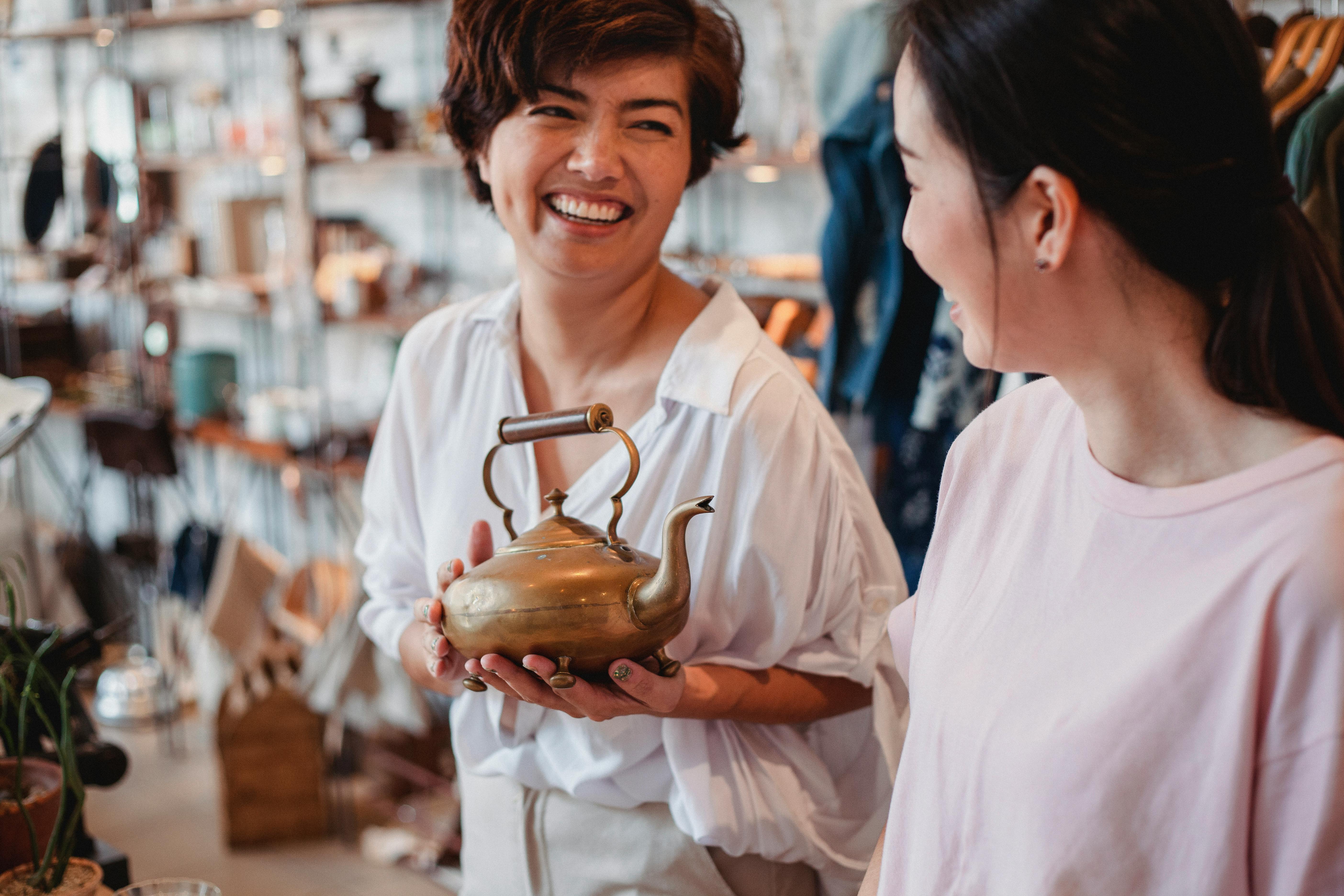
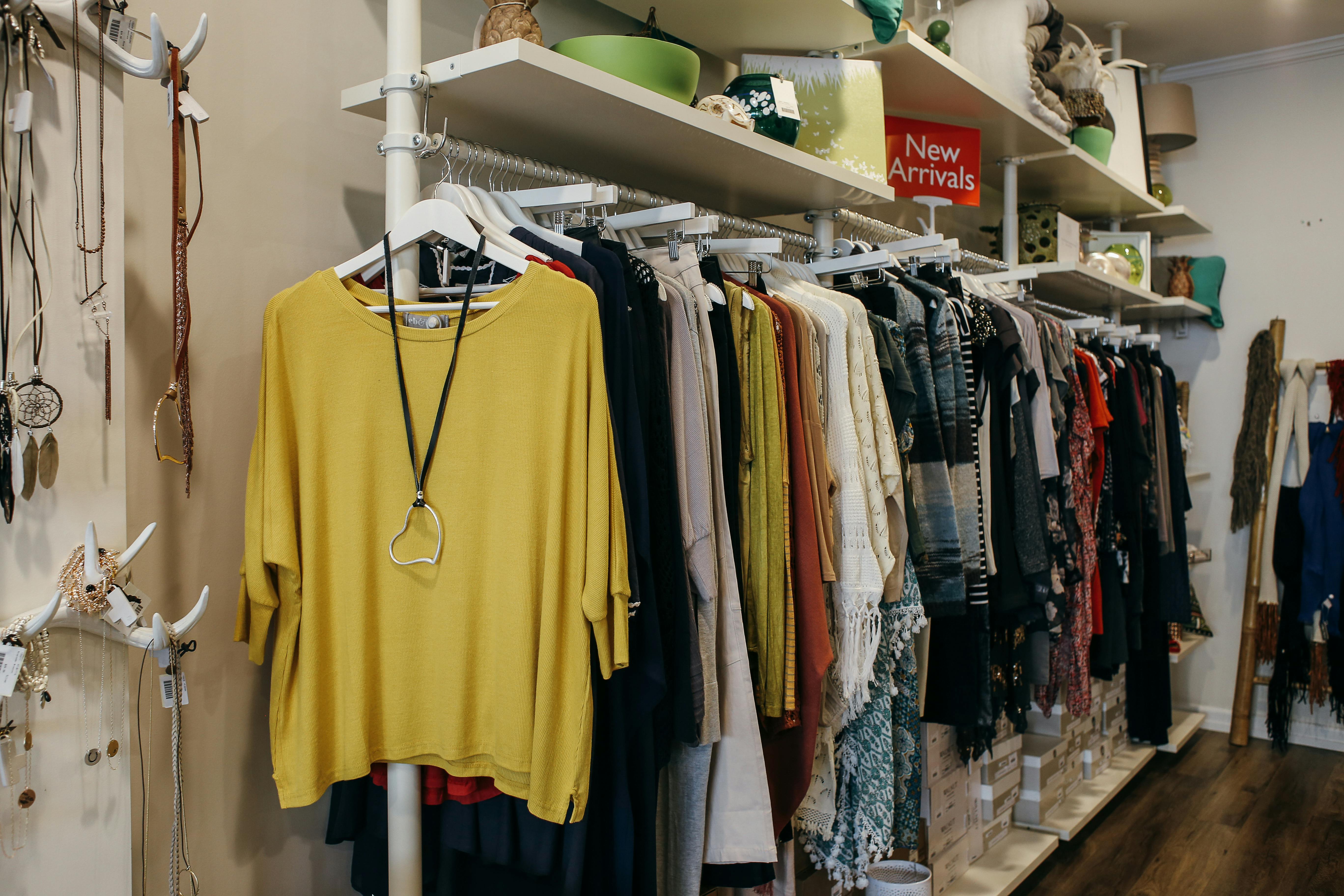
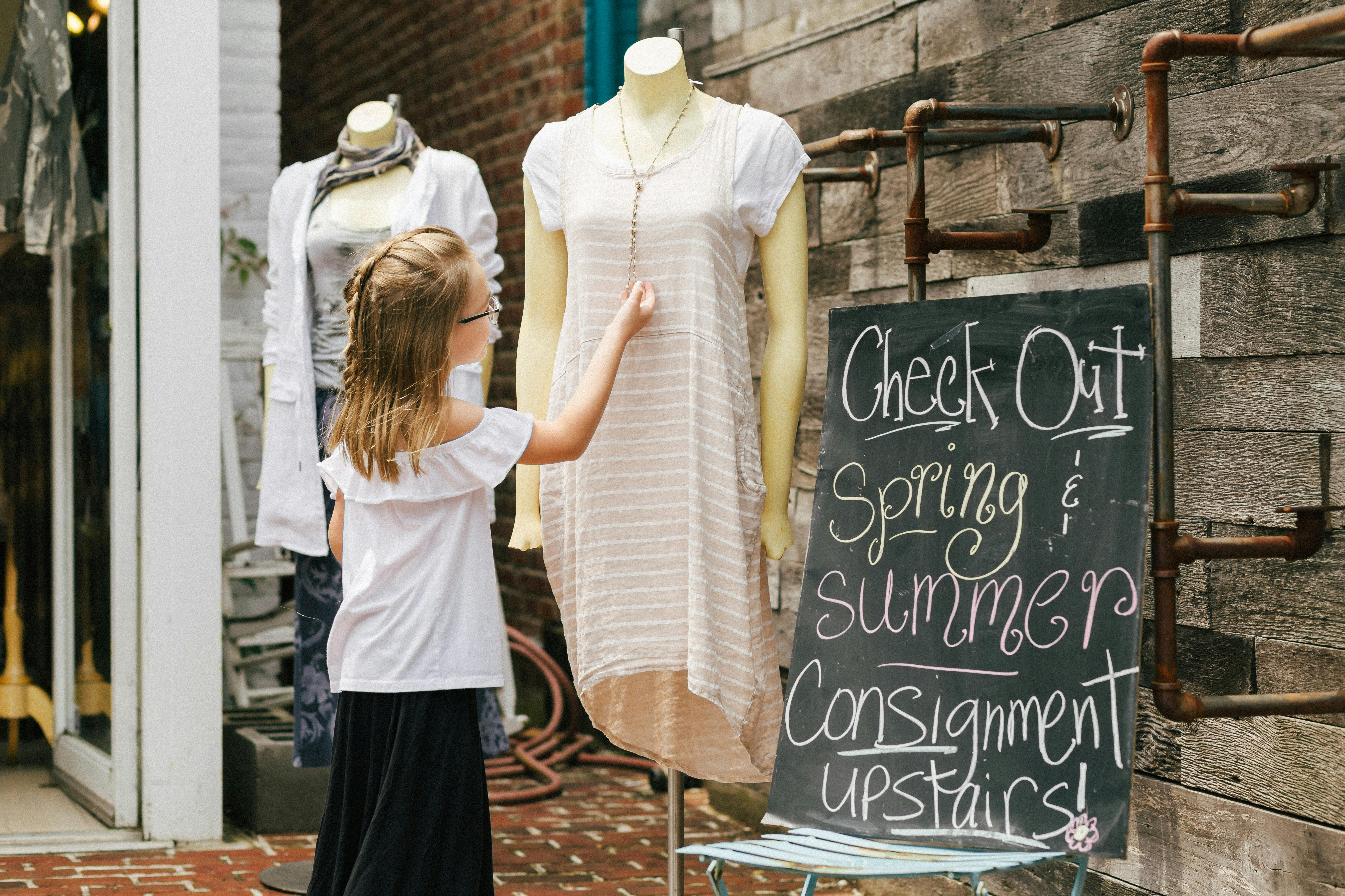
The quality of your consignors can make or break your resale store's success. Great consignors...
2025 Copyright. All rights reserved. Privacy policy. Terms.
Images courtesy of Painted Tree, Darling x Dashing Boutique, and Trove. If you're interested in sharing images from your store, please email us at marketing@simpleconsign.com, we love featuring our customers on our site. By submitting your photos, you agree to their use as marketing collateral.